Building a Color Palette for Your Wardrobe
Affiliate Disclosure: This post contains affiliate links. If you purchase through these links, we may earn a commission at no extra cost to you.
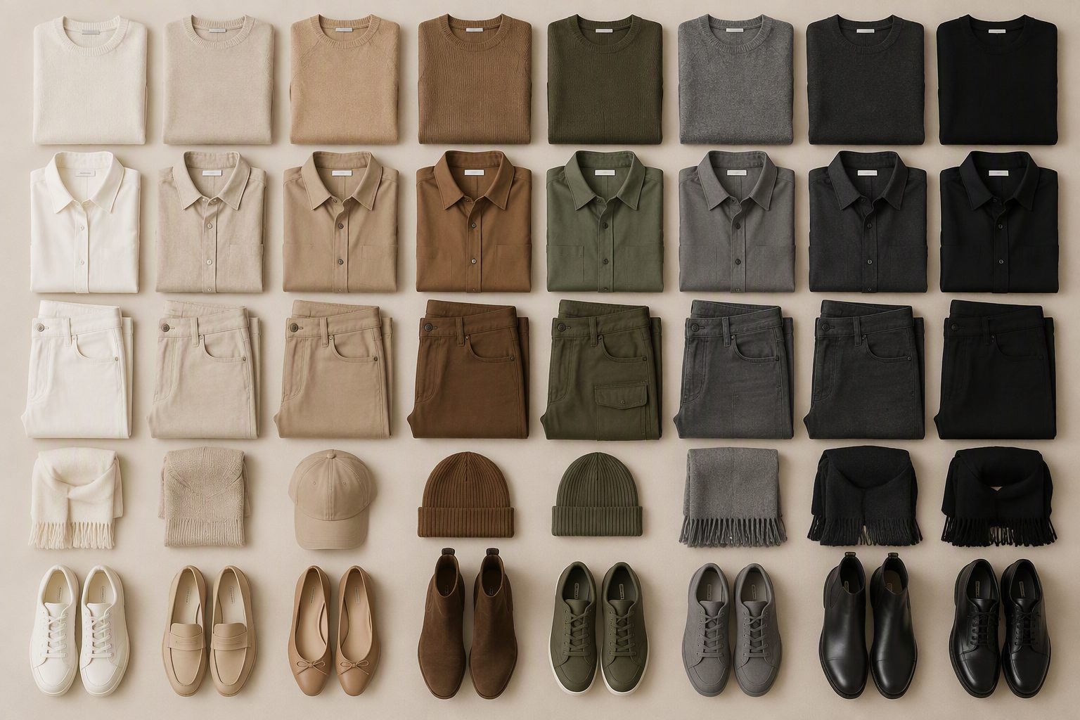
Have you ever bought something on impulse because it was on sale, only to get it home and realize it doesn’t go with anything in your closet? That’s the cost of not having a wardrobe color palette. When your clothes share a color story, every top goes with every bottom, layering is effortless, and packing for a trip is a 10-minute job.
Building a color palette isn’t about wearing only black for the rest of your life. It’s about choosing a range of colors that work together so that any random top and bottom you pull from your closet will look intentional.
Here’s how to build a color palette that works for your life, your style, and your closet.
The Three-Tier Color System
A functional wardrobe palette has three tiers:
Tier 1: Foundations (Neutrals)
These are your core colors — the pieces that form the base of every outfit. They go with everything, including each other. These are the colors of your coats, blazers, trousers, and everyday bags.
Choose two neutral colors from this list:
- Black: Classic, modern, easy to find.
- Navy: Deep and elegant. More forgiving than black.
- Cream/ivory: Soft and feminine. Beautiful in summer.
- Camel/tan: Warm and rich. Stunning in outerwear.
- Grey: Minimal and cool. Just don’t mix grey with navy — they fight.
My recommendation: Black and cream. They’re versatile year-round, available in every brand, and easily mixed with any accent color.
Tier 2: Supports (Secondary Colors)
These are colors that complement your foundations. They can be worn alone or paired with neutrals. They add depth to the palette without clashing.
Choose one to two support colors:
- Olive/khaki: Earthy and practical.
- Wine/burgundy: Rich and dramatic.
- Mustard/ochre: Warm and autumnal.
- Slate blue: Soft and sophisticated.
- Cream/ecru: A step warmer than white.
Tier 3: Accents (Statement Colors)
These are the colors that add personality and fun. They appear in one or two pieces — a sweater, a scarf, a handbag. They’re the pieces that make the outfit interesting.
Choose two to three accent colors, like coral, emerald, royal blue, or fuchsia. These will be the rarest in your closet — they only need to go with your foundations, not necessarily with each other.
Example Color Palette
Here’s a specific palette that works for most women:
Foundations:
- Black (coat, blazers, trousers, boots, bag)
- Cream/ivory (tees, sweaters, button-downs)
Supports:
- Camel (trench coat, cardigan, boots)
- Burgundy (sweater, scarf)
Accents:
- Emerald green (silk blouse, earrings)
- Gold (hoops, necklace, belt)
This palette gives you two neutrals that go with everything, two supports that complement each other, and two accents that add personality. Every piece in this palette can be worn with at least 80% of the others. The result: a closet where nothing is orphaned.
How to Apply a Color Palette
Step 1: Audit Your Closet
Pull everything out and sort by color. You’ll quickly see your dominant colors — whether you’ve been intentional or not. Most women have a natural color palette already; they just haven’t formalized it.
Step 2: Identify the Common Thread
What color appears most in your closet? What do you reach for? This is likely your foundation color. Now identify the second most common. This is your second neutral.
Step 3: Spot the Misfits
Which colors appear only once or twice? These are your orphans — the pieces that don’t go with anything else. Either build a support color around them, or plan to replace them.
Step 4: Fill the Gaps
Make a list of what you need to complete your palette. If you have black and cream but no camel, those are the pieces to shop for. This list becomes your shopping guide — anything not on the list, you don’t buy.
Color Palette for Your Skin Tone
Your palette should also flatter your coloring. While any neutral can work on any skin tone, some colors will flatter more than others:
Warm undertones (gold, peach, yellow in skin):
- Best neutrals: Cream, camel, tan
- Best supports: Olive, mustard, brick
- Best accents: Coral, turquoise, gold
Cool undertones (pink, blue, red in skin):
- Best neutrals: Black, navy, grey
- Best supports: Burgundy, slate blue, deep purple
- Best accents: Emerald, royal blue, silver
Olive undertones (green or yellow in skin):
- Best neutrals: Brown, cream, navy
- Best supports: Olive (your friend — you created it), mustard
- Best accents: Fuchsia, magenta, rust
Not sure of your undertone? Look at the veins on your wrist — green veins indicate warm, blue/purple indicates cool. If you can’t tell, you may have neutral undertones and can wear both.
Color Pairing Rules
Once you have a palette, here are reliable color combinations:
- Black + cream + gold: Classic and elegant. Always works.
- Camel + burgundy: Autumnal and rich. Perfect for fall.
- Navy + cream: Softer than black-and-white, equally timeless.
- Black + emerald: Modern and dramatic. Great for evening.
- Cream + olive: Relaxed and utilitarian. Weekend perfection.
- Grey + blush pink: Soft and feminine. Lovely for spring.
Seasonal Color Shifts
You don’t need to completely change your palette each season — just shift the emphasis:
Fall: Burgundy, camel, olive, cream, black. Rich, warm, deep colors. Winter: Black, navy, cream, grey. Coolest palette; layers add texture. Spring: Cream, light blue, blush, white. Soft, fresh, hopeful. Summer: White, cream, bright accents (coral, turquoise). Light, bright, warm.
Your foundation colors (black or navy + cream) work in all four seasons. You just change the supports and accents.
Packing with a Palette
A coordinated color palette makes packing effortless. Every item mixes and matches — you can create 20 outfits from 10 pieces because every top goes with every bottom.
Here’s the travel version of the example palette:
- 2 black pieces (jeans + cardigan)
- 2 cream pieces (tee + button-down)
- 1 burgundy piece (sweater)
- 1 camel piece (jacket)
- 1 emerald piece (silk blouse)
That’s 7 pieces in 3 colors. With this micro-capsule, you have 12 top/bottom combinations, all of which work with the camel jacket. That’s 24 outfit possibilities from a carry-on.
When to Break the Palette
Rules are made to be broken — sometimes. If you buy a piece that’s off-palette but you absolutely love it, keep it. Just make sure it goes with at least one bottom in your closet, and wear it intentionally. A leopard print item or a pink dress can be a fantastic addition to a neutral palette — as long as it’s deliberate, not accidental.
The palette is a framework, not a prison. Use it to shop intentionally most of the time, and the occasional exception becomes a statement.
The Payoff
Building a color palette is the single most effective thing you can do to simplify your morning routine. When everything goes together, you stop trying combinations and start simply picking pieces. Your closet feels bigger because everything works. Your outfits look more intentional because they are.
Start with two neutrals, add one support, and see how it feels. You’ll know it’s working when you can get dressed in the dark and still look pulled together. That’s the power of a coordinated color palette — less thinking, better style, more time for the things that actually matter.